Spectral
Audio Post-Production / Soho, UK
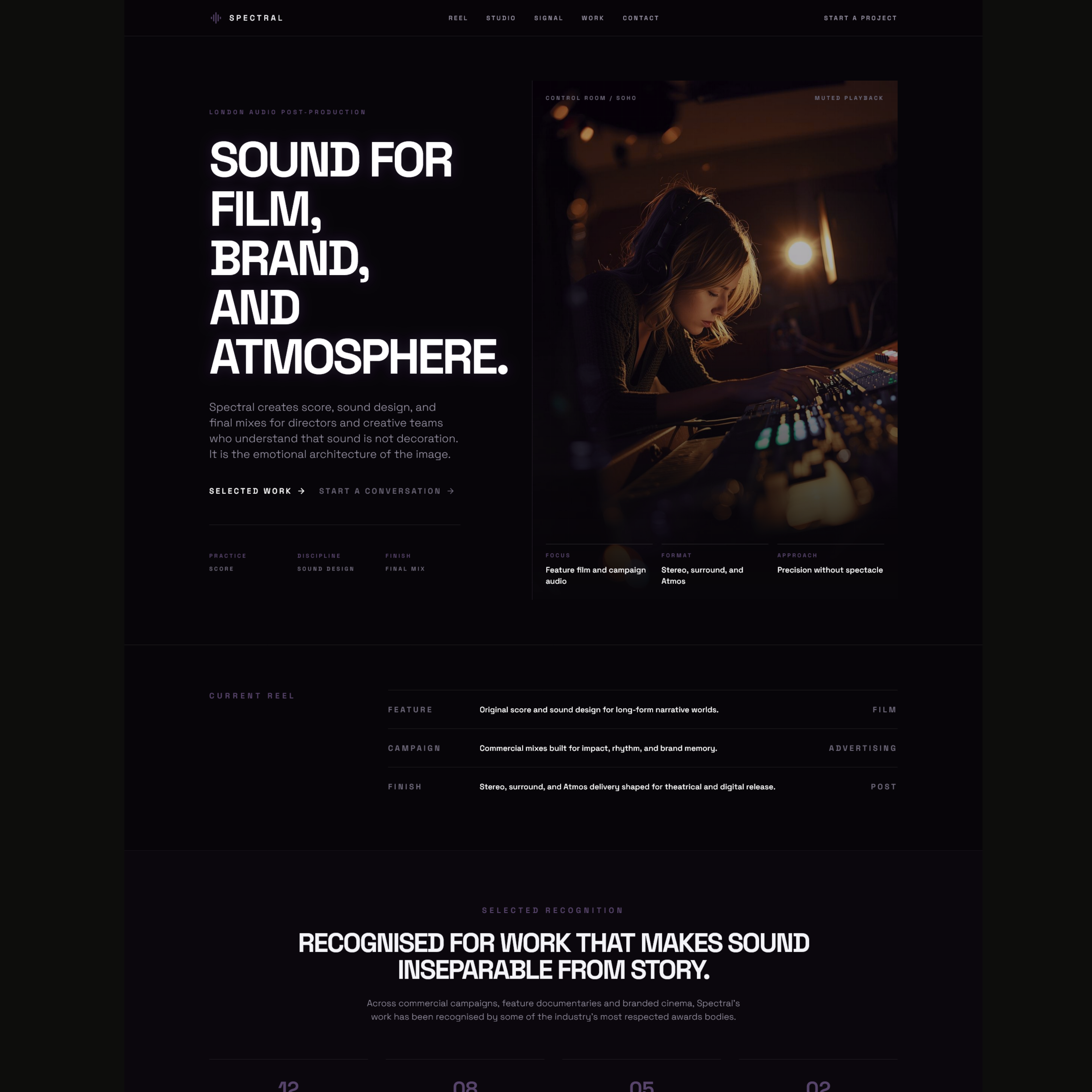
Spectral needed a website that felt as precise and atmospheric as the work itself — something that could communicate technical credibility without losing the mood, restraint, and cinematic character of the studio.
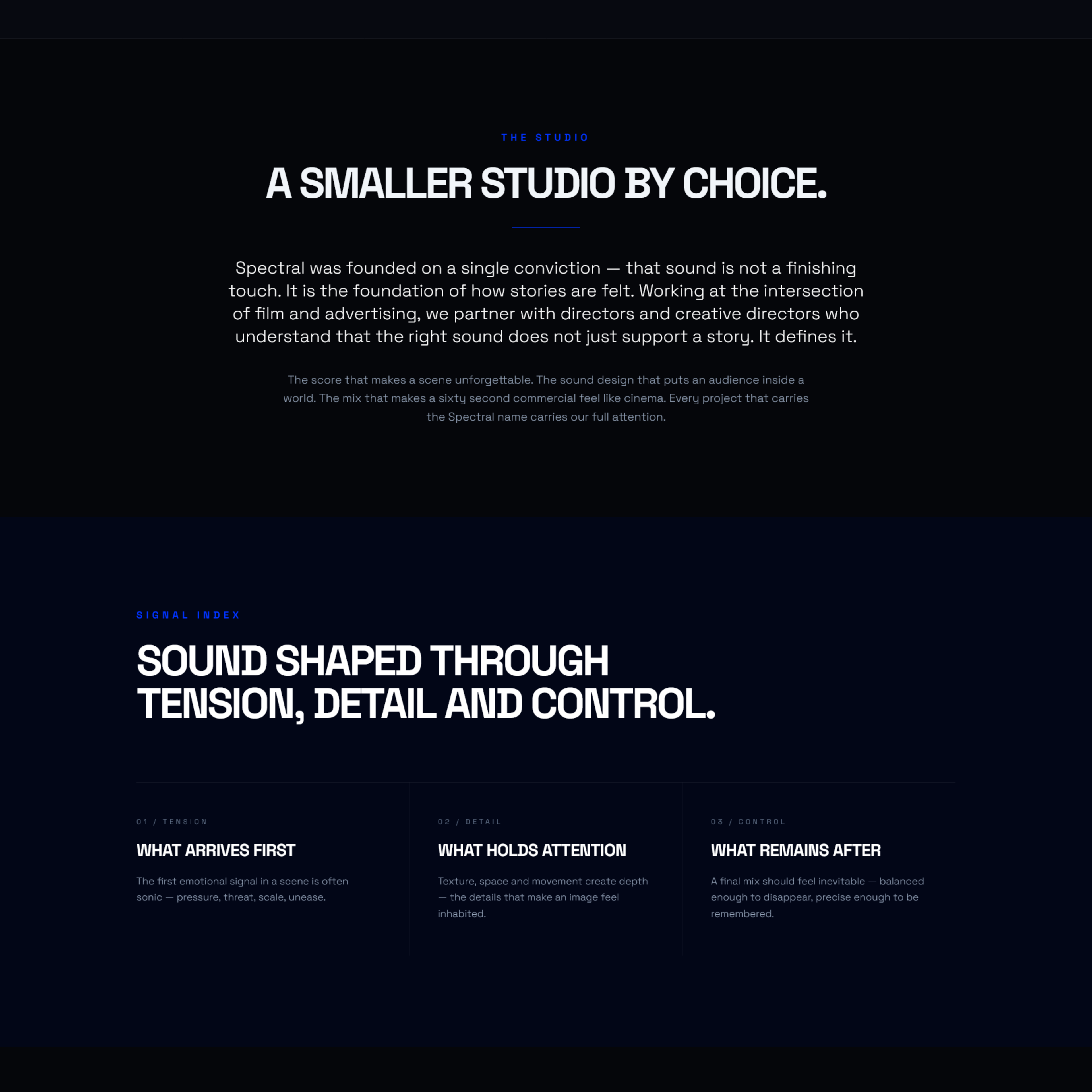
The challenge was to create an online presence that felt quiet but unmistakable. This was not a brand that needed noise. It needed control, confidence, and a visual language that suggested expertise through composition rather than clutter.
“Capturing the silence as much as the sound.”
Typography
The typography needed to feel composed and cinematic rather than loud. A high-contrast serif gave the project its editorial gravity, while restrained supporting type kept everything clean, technical, and clear.
Colour
The palette leaned into warmth, smoke, and shadow rather than obvious “audio studio” clichés. The result feels atmospheric without drifting into darkness for its own sake.
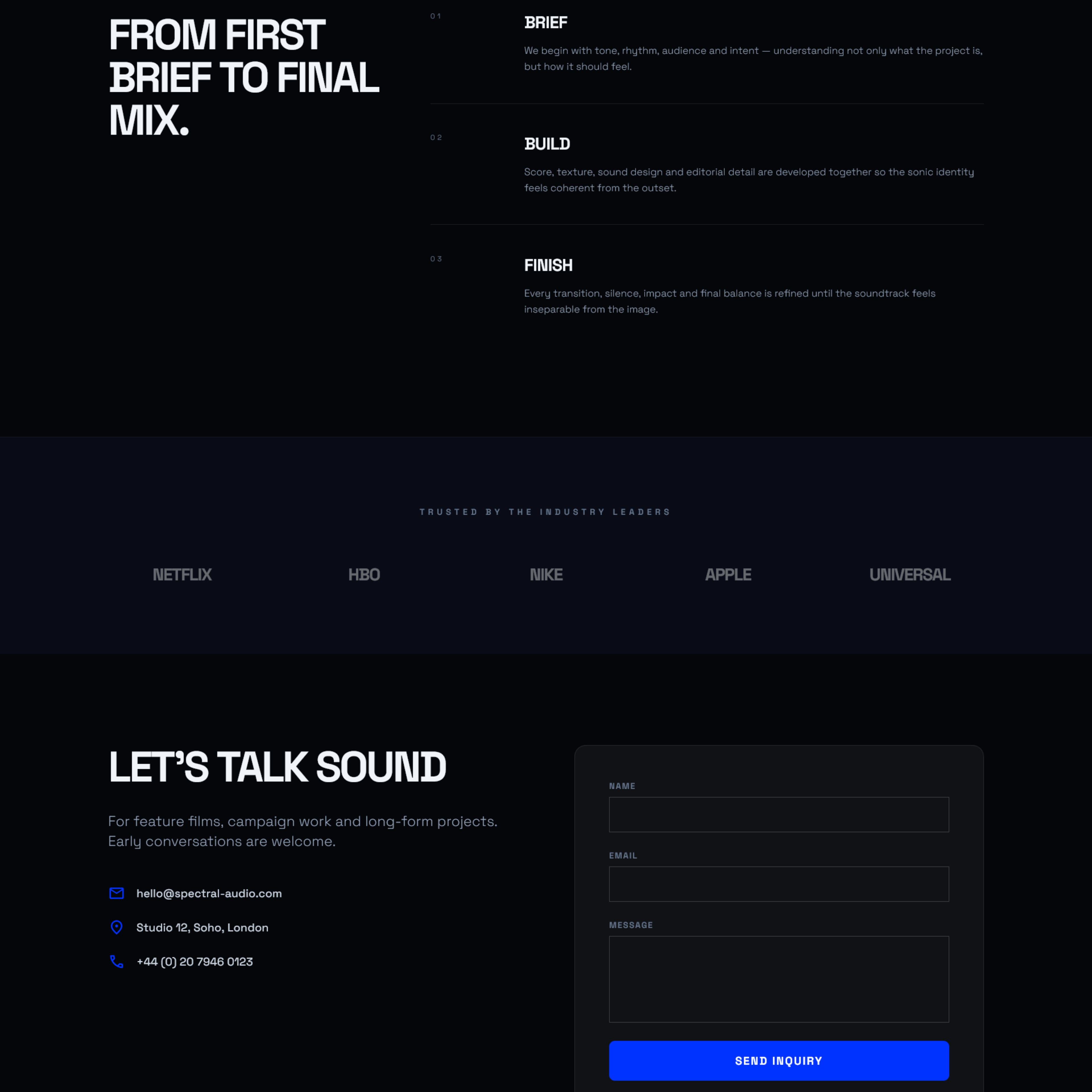
Layout
The layout was treated like a feature spread — measured, spacious, and deliberate. Pacing mattered as much as content, allowing the work to feel premium before a single claim had to be made.
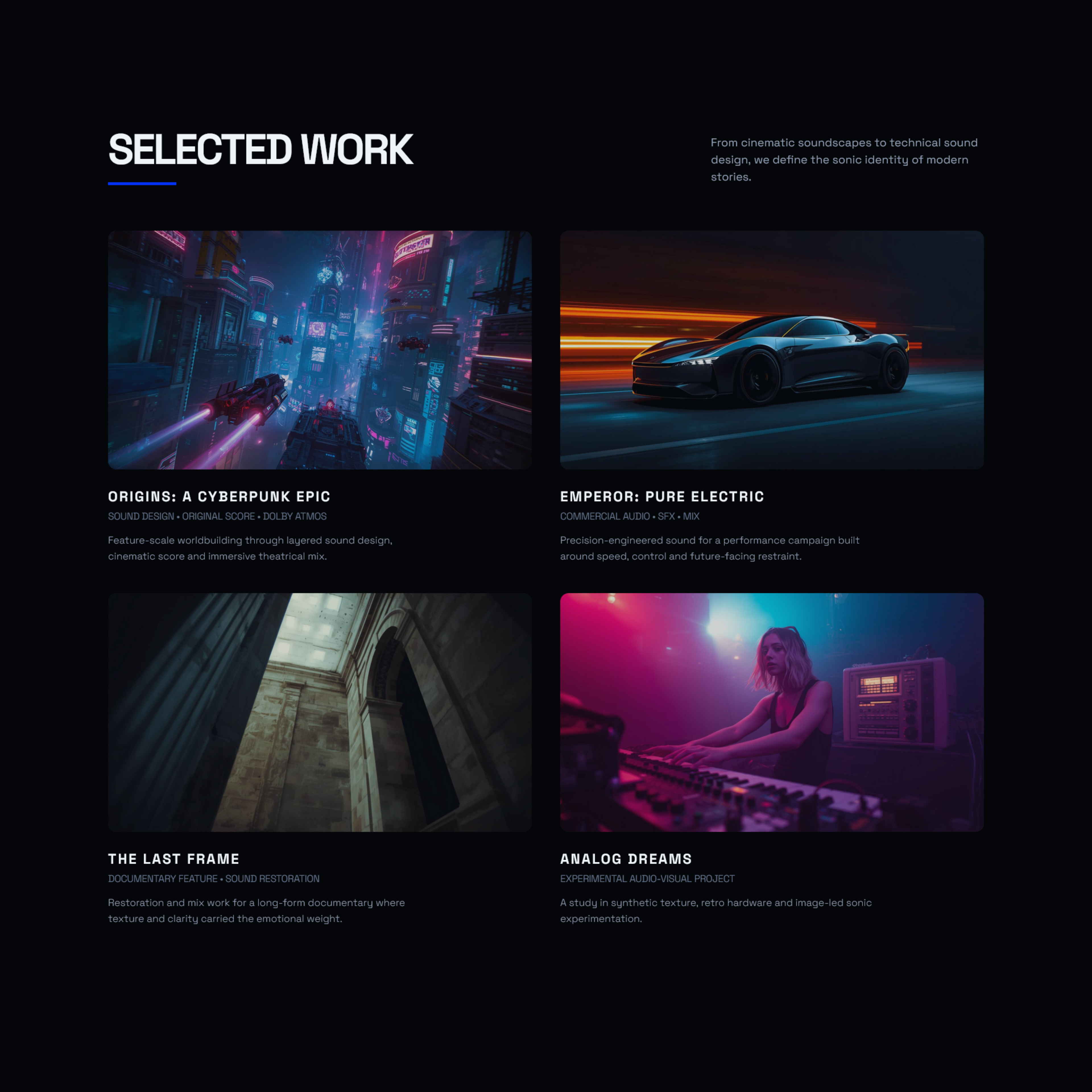
A concept site with real atmosphere, sharper positioning, and a visual identity that allows the studio to feel both technically capable and creatively distinct.
The finished direction gives Spectral a stronger editorial presence, turning a specialist service into something more memorable, more tactile, and more clearly premium.
“A website direction that feels like the studio already sounds.”
Placeholder testimonial
Next — Deathwings