Deathwings
Metal Lifestyle Brand / Birmingham, UK
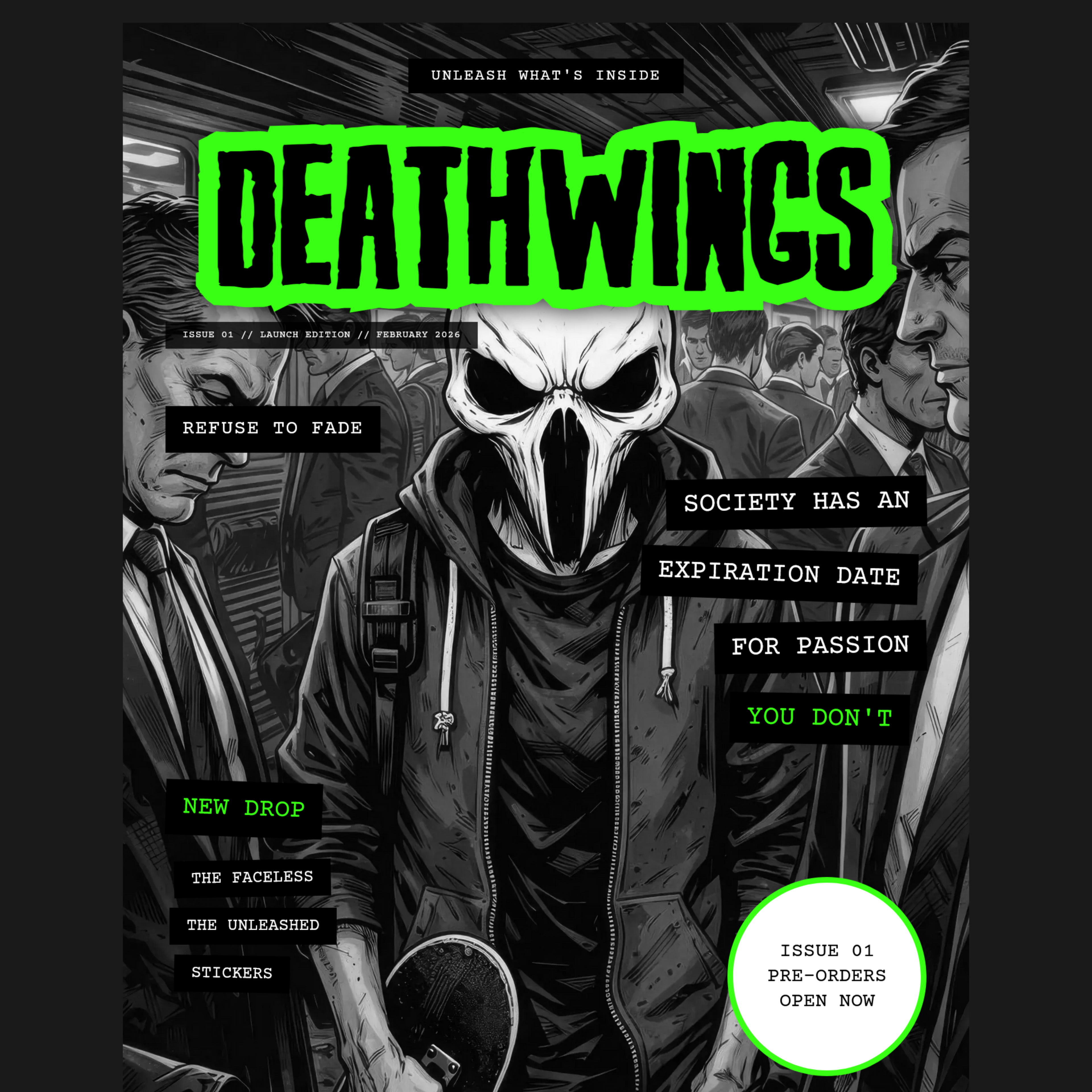
Deathwings needed a website that felt as uncompromising as the culture it represents — a digital home for a counter-culture lifestyle brand that refused to look like anything else in the market.
The challenge was to build something bold and disruptive without losing the structural integrity that makes a site actually work. The design had to feel dangerous without being chaotic — every element placed with intention, every decision rooted in the brand's core philosophy: Refuse To Fade.
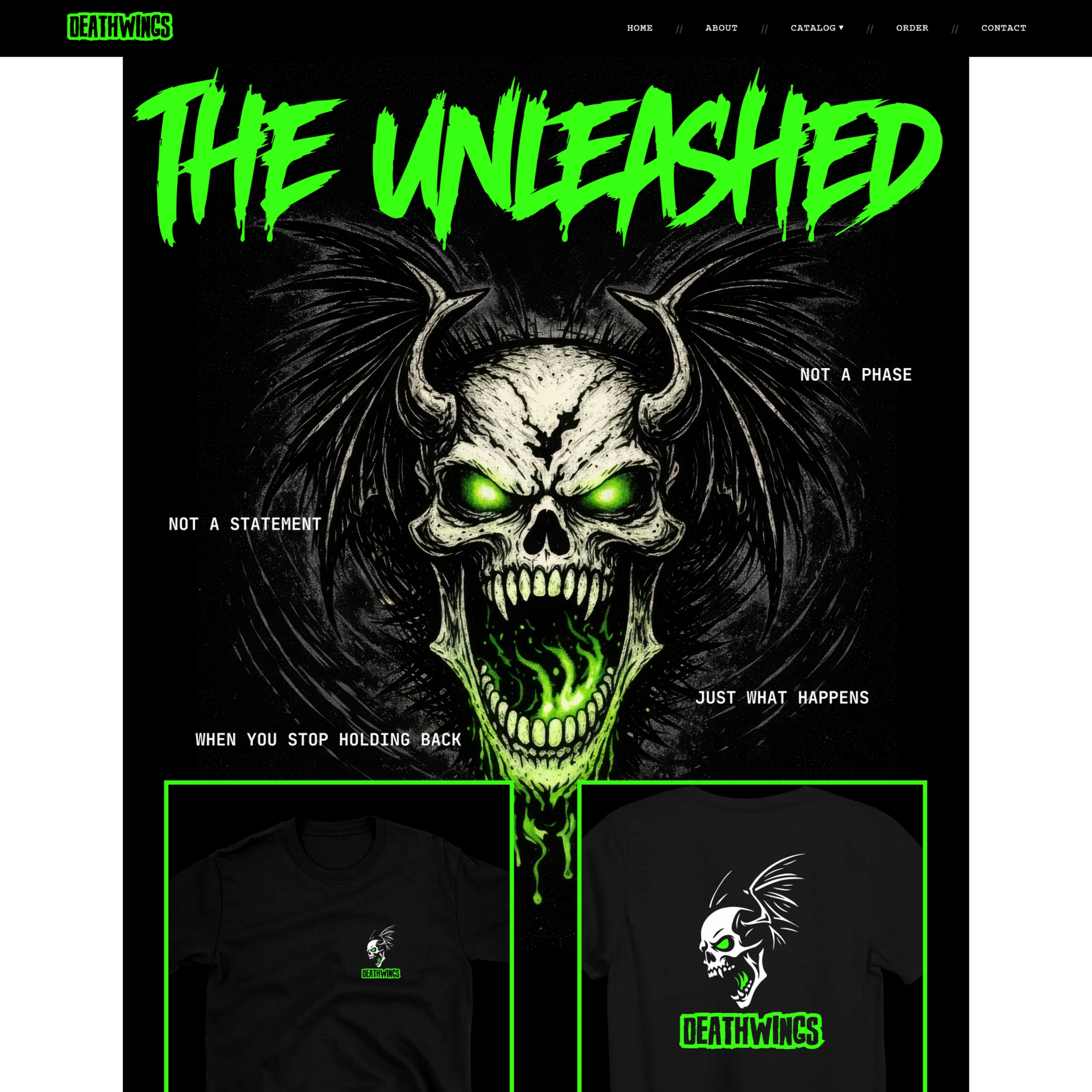
"Society has an expiration date. Your style doesn't."
Typography
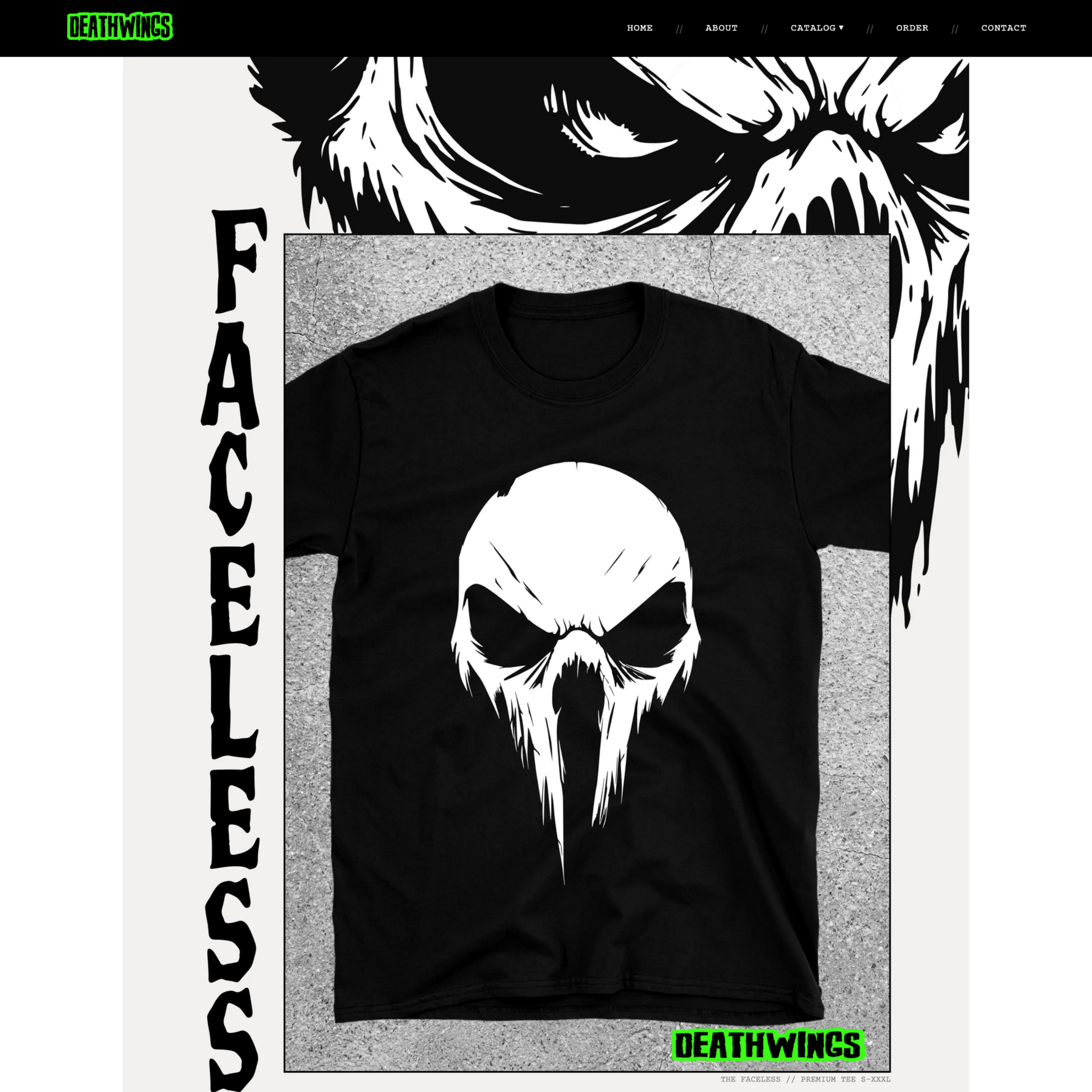
Custom display type that hits like a magazine cover from another dimension. Every headline demands attention — bold, unapologetic, and completely ownable.
Colour
Near-black backgrounds, #39FF14 neon green. The most confrontational colour combination in the palette — and the most memorable. It signals immediately that this is not a brand that asks permission.
Layout
An A4 magazine format structure underlying everything. The chaos is controlled — editorial discipline applied at full intensity, proving that structure and disruption are not opposites.
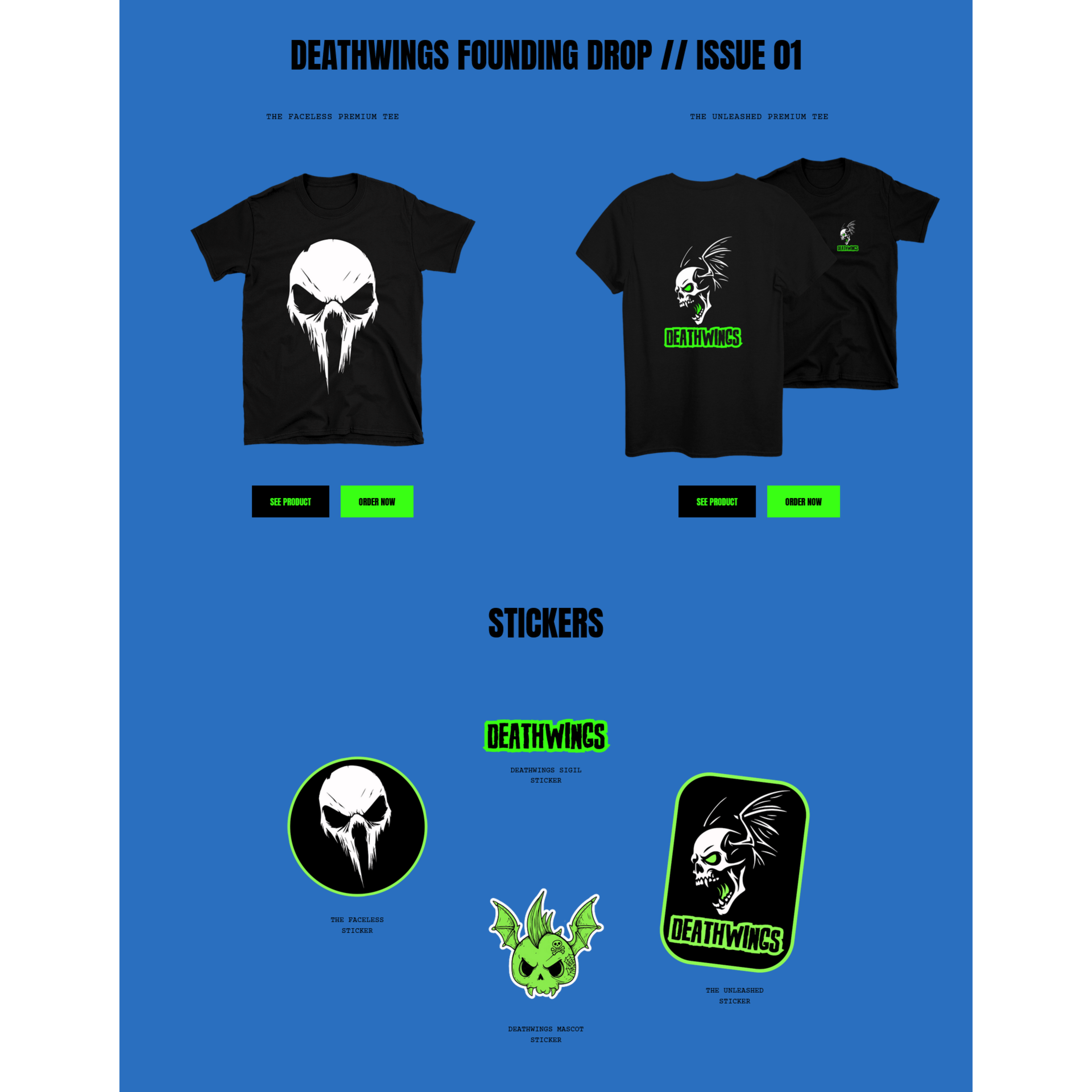
A live brand with a genuine community behind it. Launched February 14th 2026, Deathwings is proof that editorial magazine thinking works at full intensity.
The Refuse To Fade philosophy runs through every design decision — from the A4 magazine grid to the neon green accent. A brand built to last, for people who refuse to disappear.
Spectral